Being a retail store owner can be very rewarding, but running a store is not a piece of cake. Especially in today’s world of instant gratification through the convenience of same or next-day home deliveries. When you have an online store, a website, and inventory management are all you need.
However, with retail spaces, you also have to think about giving customers a reason to enter your store.
“The thing is, I don’t want to be sold to when I walk into a store. I want to be welcomed.”
– Angela Ahrendts, Senior Vice President of Retail, Apple Inc.
…and that is exactly what you, as a retailer, should strive for.
However, every time we talk about giving potential customers more reasons to enter a store, we focus on customer service, return-and-refund policies, and inventory. Don’t get me wrong. These are important to succeed as a retailer.
However, the way you plan your store – the nuances of interior design detailing – also play an important role in increasing your in-store footfall.
Rachel Shechtman, Founder of Story, has a similar viewpoint, “There is a solid chance that you can be using square footage more productively. We don’t need another retailer selling jeans and black pants unless they bring a point of view and an experience that no one else has.”
So, how do you create such an experience?
What changes can you make in your physical space that will call out to passers-by to step into your store?
The answer lies in the way you plan your interiors, set the tone with the right colors, and create a more immersive experience for your potential customers.


#1: The Right Store Layout Works Wonders
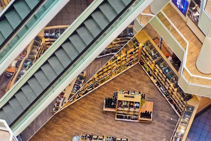
Before you even think about visual merchandising and branding, you have to find a layout that will be the best fit for your business. The store layout is nothing but a strategic arrangement of permanent fixtures inside your store to create a positive shopping experience for your customers.
This is where the layout drawing of a building comes into play. The right floor plan designs have the potential to drive your sales through the roof.
For example, a boutique might showcase a carefully curated selection of fewer items for a more explorational shopping experience whereas a grocery store might benefit from a layout that can hold and showcase as many choices as possible.
Finding and creating the right layout is determined by the kind of merchandise you plan on selling, the space that your store has, and how you want shoppers to move around, within that space. An interior drafting company can plan your store’s interior design drawings to help you get the most out of your space.
Finding and creating the right layout is determined by the kind of merchandise you plan on selling, the space that your store has, and how you want shoppers to move around, within that space. An interior drafting company can plan your store’s interior design drawings to help you get the most out of your space.
#2: Let Colors Speak On Behalf Of Your Business
You know exactly what shade of green, red, and blue I’m referring to, don’t you? Buyers connect with colors on a deeper level, so much so that over 50% of the seven-second first impressions are made based on colors.
Starbucks green.
Target red.
Ikea blue.
For example, vibrantly painted shops offer a positive shopping experience. But, overplay your hand with too much color and you can end up overwhelming your patrons, causing them to exit early.
Incorporate colors thoughtfully into your retail interior design. Don’t be shy to use interior drafting services where experts can help you pick the right colors. They can even show you designs with different color schemes to help you make the best choice.
#3: Carve Out A Space For Everyday Tasks
When implementing your store design, find the tasks that will happen as part of store management and upkeep. Then, make sure your layout drawings include space to accommodate these tasks.
For instance, your clothing shop might need a backstory of stocking more inventory. Meanwhile, a gift and flower shop will benefit from having a gift wrapping and bouquet station.
#4: Let In-store Traffic Decide The Store Layout
Studies show that footfall within stores is influenced by vehicular patterns on the road. Herb Sorensen, author of Inside the Mind of the Shopper notes,
“The pattern of movement in the supermarket is counterclockwise in the United States, but PathTracker studies in the UK, Australia, and Japan show a much greater tendency for shoppers to move in a clockwise pattern there… traffic patterns in the store may also be affected by vehicle traffic patterns outside. In these small studies, we noted that in countries with right-hand driving, where traffic circles move in a clockwise pattern, shoppers in stores may be more comfortable moving in the same direction.”
This information may help you lead customers in the direction of the traffic. However, don’t base all merchandising decisions on studies alone. Use foot traffic tools to analyze how buyers move about in your store to figure out the traffic patterns of your patrons.
#5: Get The Curb Appeal Going
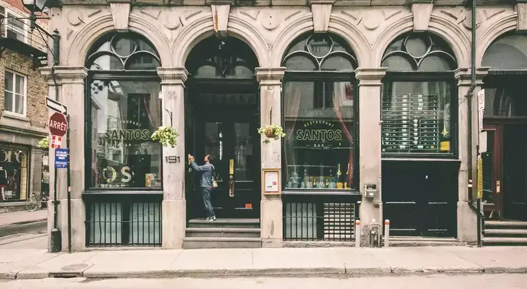
Curb appeal is important – nearly 95% of shoppers consider a store’s external appearance when deciding where to shop!
The exterior of your store – from your window displays to the size and color of your awning – has to be at par (if not greater) than the interiors of your store. The goal of your store’s front layout is to entice people walking by to enter your store.
1. Be bold with your exterior design. Give people a taste of what they can expect from your business.
2. Bright colors, smart product placements, and innovative designs can help you create an irresistible charm that will bind potential buyers to at least give your store a try.
When figuring out your store’s layout, make sure that you have ample exterior space in your interior design drawings to amp up the curb appeal of your store.
#6: Don’t Mix Merchandise And The Decompression Zone
The threshold area, also known as the decompression zone, is the very first area that shoppers see when they enter your store. It is also the space where your customers transition from the outside world and first experience what your store has to offer.
At this point, they critically analyze how cheap or expensive your store is, and how synchronized your colors, lighting, displays, and fixtures are.
Because they are in a transition mode, customers are likely to miss any products, carts, or signage that you place in this zone.
Paco Underhill, author of Why We Buy: The Science of Shopping, explains, “By the time the person is starting to engage with the physical environment, some of the stuff you’ve put by the door is blown past.”
The way around this?
1. Ease your shoppers into the store – don’t bombard them.
2. Leverage drafting services to plan your layout in a manner where you have ample space for shoppers to roam around in this area with fewer products to ignore.
#7: Pave A Path For Shoppers In Your Design Drawings
The next time you walk into a retail store, observe your first move. Odds are, you turn right. Most shoppers do.
The first wall that customers see after entering and likely turning right is a power wall. This is a high-impact impression vehicle for your merchandise. Give extra attention to what you place and how you help customers reach this space. Use racks, furniture, and displays to make a clear path for patrons to journey through your store.
A well-thought-out path doesn’t just increase the likelihood of customers making a purchase. It also controls the ebb and flow of in-store footfall. This helps managers and staff handle busy shopping intervals, measure buyer engagement, and better supervise the store.
When planning the interior design drawing of your store, pay heed to the path your customers will most likely take. This will help you create an optimal shopping path that takes buyers on a journey from discovery to ownership.
#8: Add Speed Bumps
Brian Dyches, Chief Experience Officer at Ikonic Tonic studied shopping patterns and found that “up to 20 percent of the store’s merchandise is skipped over” because of long uninterrupted aisles.
Having the same fixtures or aisles everywhere can result in shoppers skipping over merchandise. How to fix this? Use “speed bumps”. These are visual breaks that split long aisles.
They are often in the form of signs or displays. A lot of supermarkets leverage this tactic. They place large, attention-grabbing displays to invigorate the store layout.
Sephora is a great example of using speed bumps successfully. Their stores are punctuated with visual breaks that engross potential shoppers.
Below, you can see an interactive display that encourages people to take a quiz to discover their fragrances. In addition to creating an immersive experience, this display acts like a speed bump, slowing down shoppers as they browse the shelf.

#9: Keep Your Customers Comfortable
Are you aware of the “butt-brush effect”, coined by Pack Underhill? He discovered that most shoppers, especially women, will avoid an aisle if there’s a chance to potentially brush their backside against another customer. This holds even if the buyer is very interested in a given product.
Again, effective interior drafting can help you handle this issue. The easiest thing would be to offer more space for customers to walk while they browse racks and aisles.
But if your store has limited space in between aisles, you can incorporate a waiting area with seats and benches to make your store more comfortable. This space will prove helpful for shoppers who are accompanied by a child or a partner who is not interested in shopping.
#10: Create Focal Points
Focal points are fixtures and display pieces that are designed to draw the eye and guide shoppers through your store. Think of a cluster of mannequins, a basket filled with products, or a POP display. Focal points are often placed near key areas such as entrances, window displays, or high-traffic areas.
Focal points act as stepping stones for your store. Customers will instantly gravitate toward them due to their aesthetics. Ideally, you would want to place focal points in all the areas you want patrons to drift to.
- Use bright colors different from your store’s branding to offer contrast and attract attention.
- Create a visual draw by utilizing height. Eyes automatically notice higher points.
- Focal points need not be shoppable, so get those creative juices flowing. Add dramatic lighting, music, or a bit of an extravaganza to up the ante.
The Final Note
“Until Amazon creates a drone that can cut your hair, there’s a physical and real reason to come to the store.” – Mary Dillon, CEO, Foot Locker.
Retail design is a never-ending process. With constantly changing design trends, you always have to be tweaking, adding, or switching up to create a resonating customer journey and experience. But at the end of the day, you can always use tools that help make your life easier.
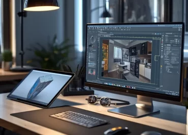
Architectural interior drafting can help you plan your store more effectively, giving your customers a seamless and enjoyable shopping experience. For more details to get started with interior design drafting, reach out to our experts right away!


